LogTruck is positioned as the “control tower” for SMB shippers who still run shipping operations through spreadsheets, calls, and email threads, so the case study should frame the work as turning chaos into real-time clarity.
CLIENT
LogTruck
YEAR
2026
SCOPE OF WORK
Website Design
Product Design
Dashboard
UX Research
Branding Design
Repositioning LogTruck
As LogTruck’s product matured, the interface and messaging needed to catch up to what the platform actually delivered: real-time visibility, faster dispatching, and fewer missed details across shipments, carriers, and invoices.
The challenge was making logistics feel manageable for teams shipping 150-400 loads per month, many of whom have never adopted a TMS and rely on Excel plus constant back-and-forth communication to keep operations moving.
The existing product was feature-rich but usability-poor. It failed to match the mental model of a logistics manager who lives in a state of constant urgency.
Fragmentation: Users had to open 5+ tabs to find a shipment’s status, carrier info, and invoice.
Manual Friction: Creating a new quote required re-entering data from scratch every time.
Financial Blindspots: No clear view of unpaid invoices led to friction with carriers and delayed freight release.
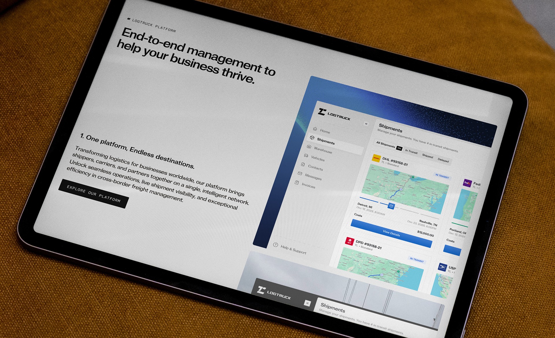
Transform LogTruck from a "database interface" into a "Control Tower" a centralized, real-time command center that gives shippers total visibility without the cognitive overload.
Dispatcher: Needs speed. Lives in the "Now". Wants to get freight off the dock.
The Finance Admin: Needs accuracy. Lives in the "Past". Want to reconcile invoices and pay carriers.

Repositioning LogTruck
The target audience (SMB shippers in the $10–100M revenue range) isn’t looking for “enterprise transformation” language, they need a tool that reduces manual coordination and helps them stay in control hour by hour.
The product story was reframed around one idea: a single, reliable place to see fleet status, act on exceptions, and reuse shipment knowledge (past deliveries, carrier quotes, invoice state) without digging through spreadsheets and inboxes.
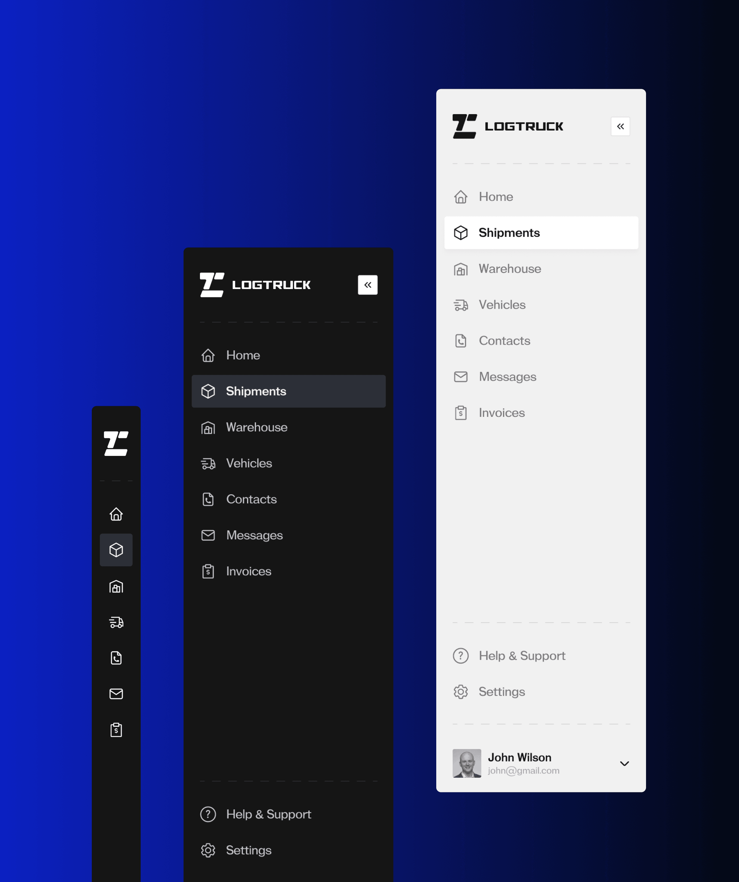
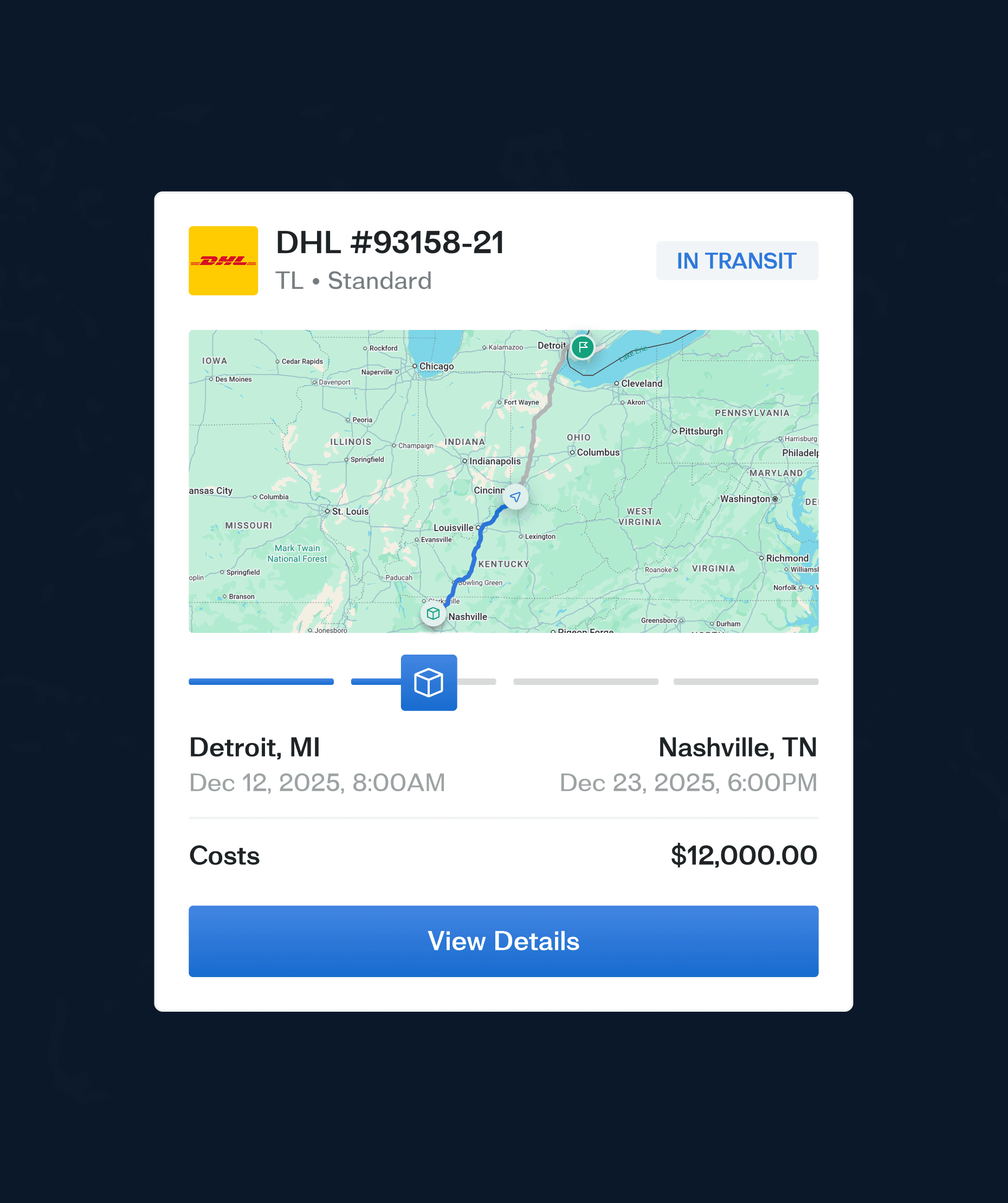
UX/UI: control tower interface
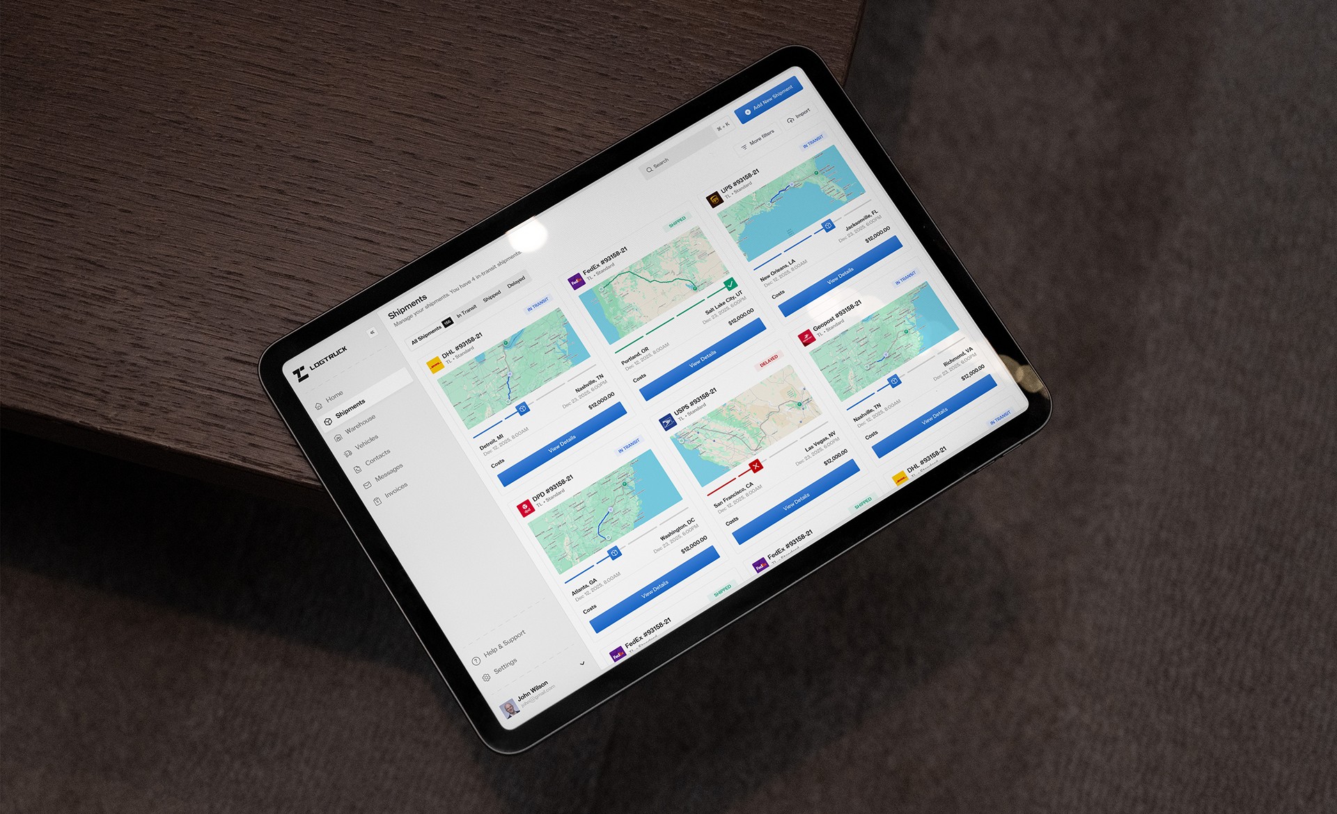
The UX was designed around the user’s core needs: track everything on a map, dispatch quickly, see multiple statuses at once, reuse delivered shipments to build new quotes, and keep an overview of unpaid invoices.
The IA prioritizes “today’s work” first, then “exceptions,” then “history”, so the dashboard always answers: What’s happening now, what needs attention, and what can be reused?
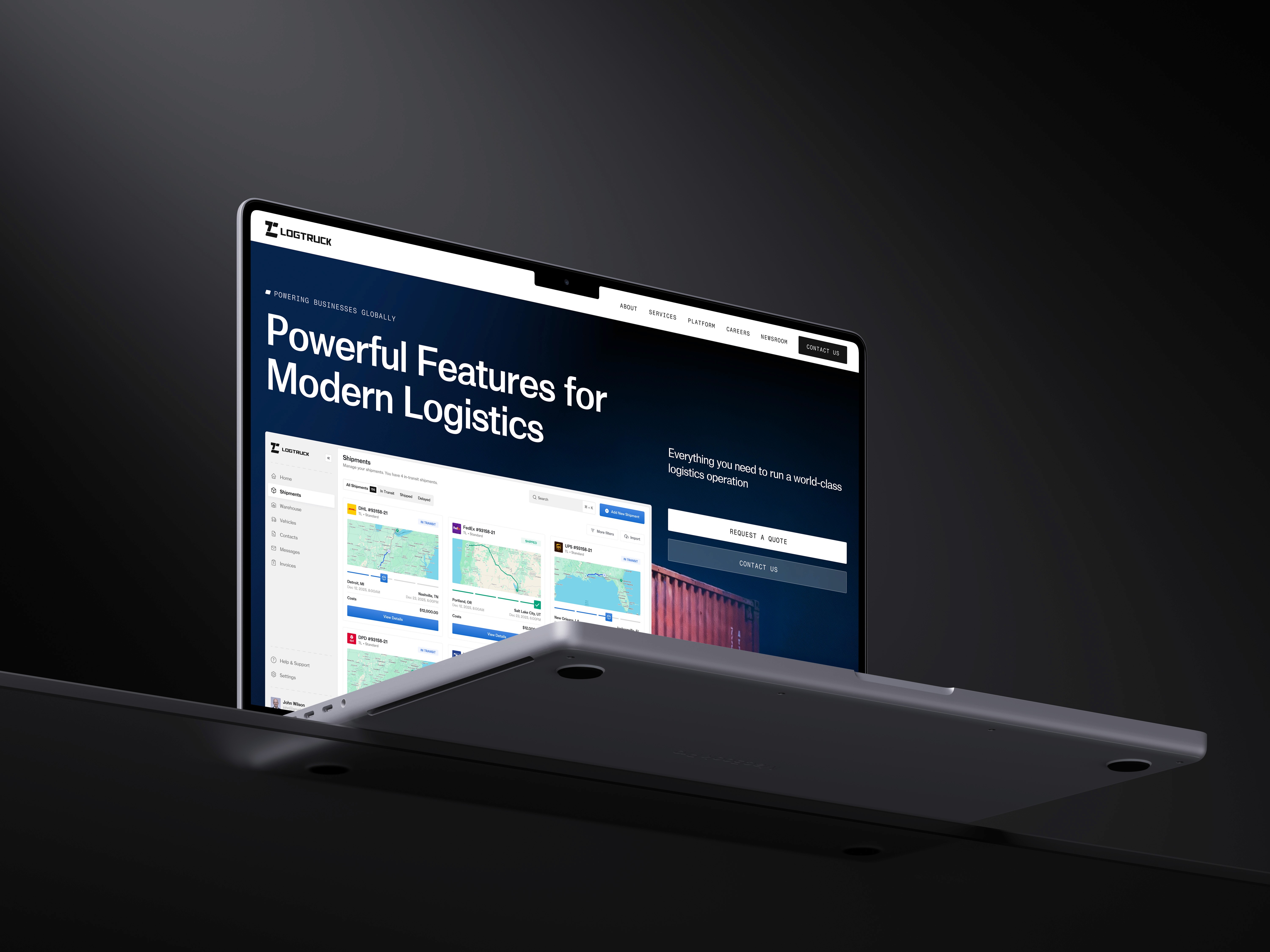
Live Map + Fleet Layer: A map-first view with filter chips (Carrier, Lane, Status, ETA risk) and a right-side details drawer for one-click actions (message carrier, update appointment, reassign).
Dispatch Board: A column-based board (Planned → Tendered → Picked Up → In Transit → Delivered) with bulk actions, fast edits, and a “next best action” hint for delayed/at-risk loads.
Shipment Timeline: A unified event timeline per shipment (route events, comms, docs) to eliminate scattered email chains and make handoffs easier.
Quote Reuse Flow: “Use delivered shipment as template” that copies lane, accessorials, carrier performance notes, and historical rates into a new quote draft.
Invoices & Aging: A dedicated invoice view that mirrors ops reality: paid/unpaid states, aging buckets, and filters to reconcile by carrier, lane, or customer.
UI system: fast, calm, scalable
Because logistics dashboards can become visually overwhelming, the UI system was built to stay calm under pressure: strong hierarchy, restrained surfaces, and color reserved for meaning (status, risk, and action).
Accessibility-friendly status tokens (On track, At risk, Delayed, Delivered) ensure “scanability” across dense tables and boards, while consistent components (filters, drawers, timelines, bulk actions) reduce learning time for teams new to TMS-style software.
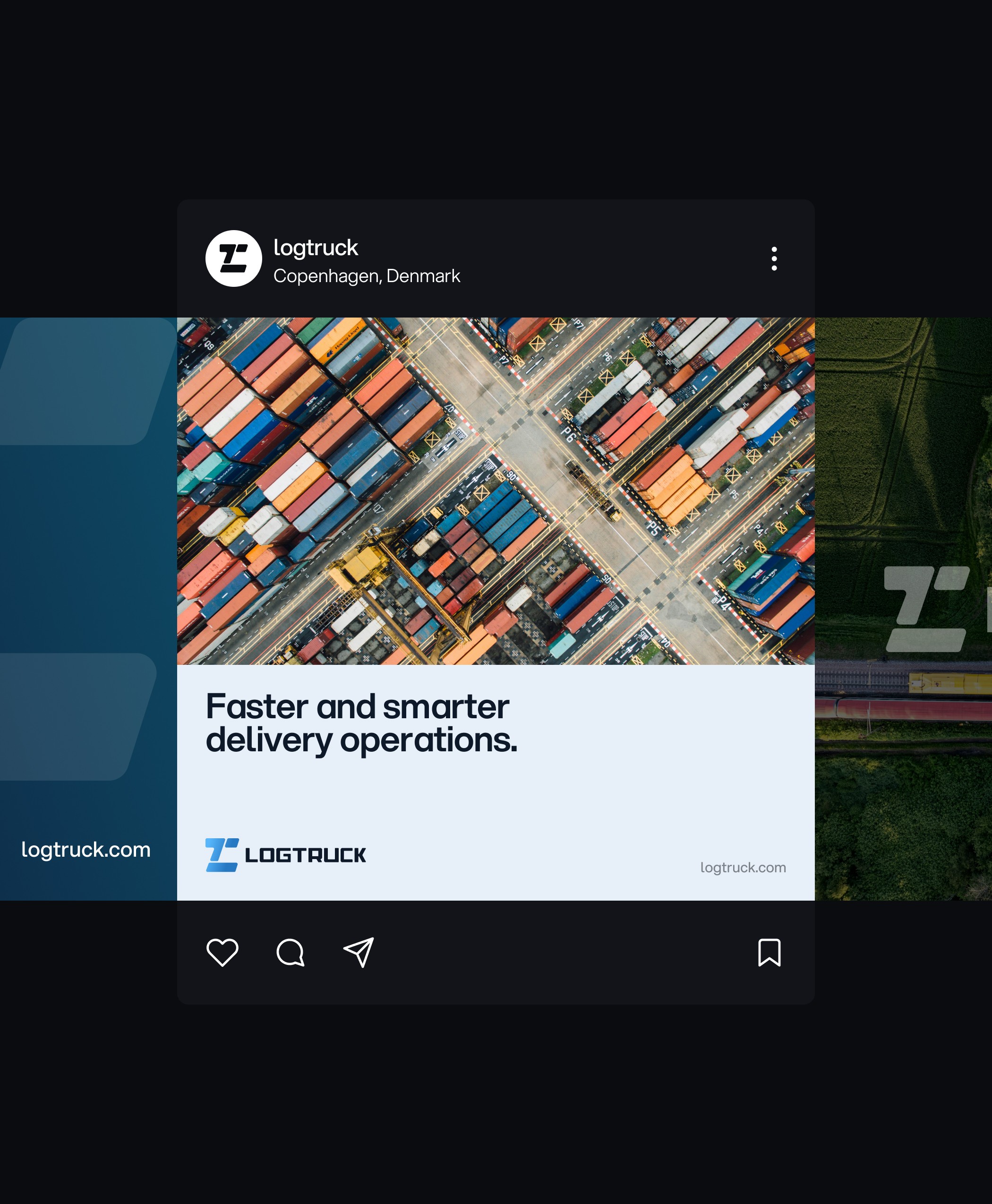
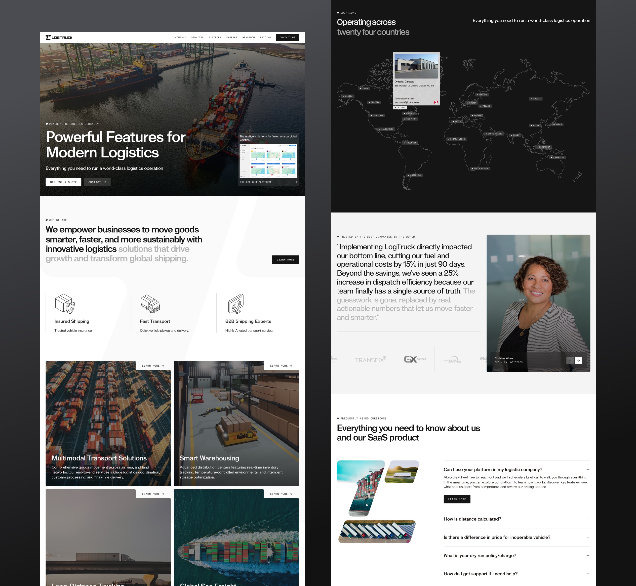
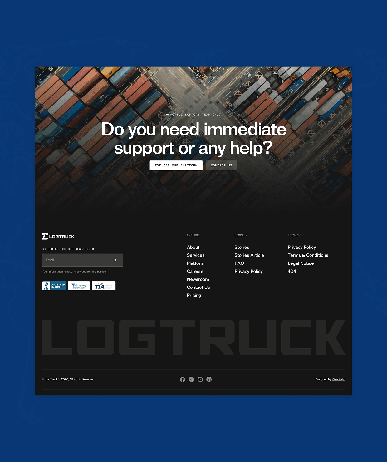
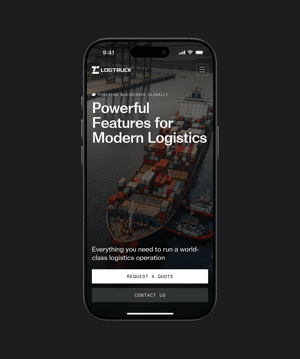
Website: Building Trust at Scale
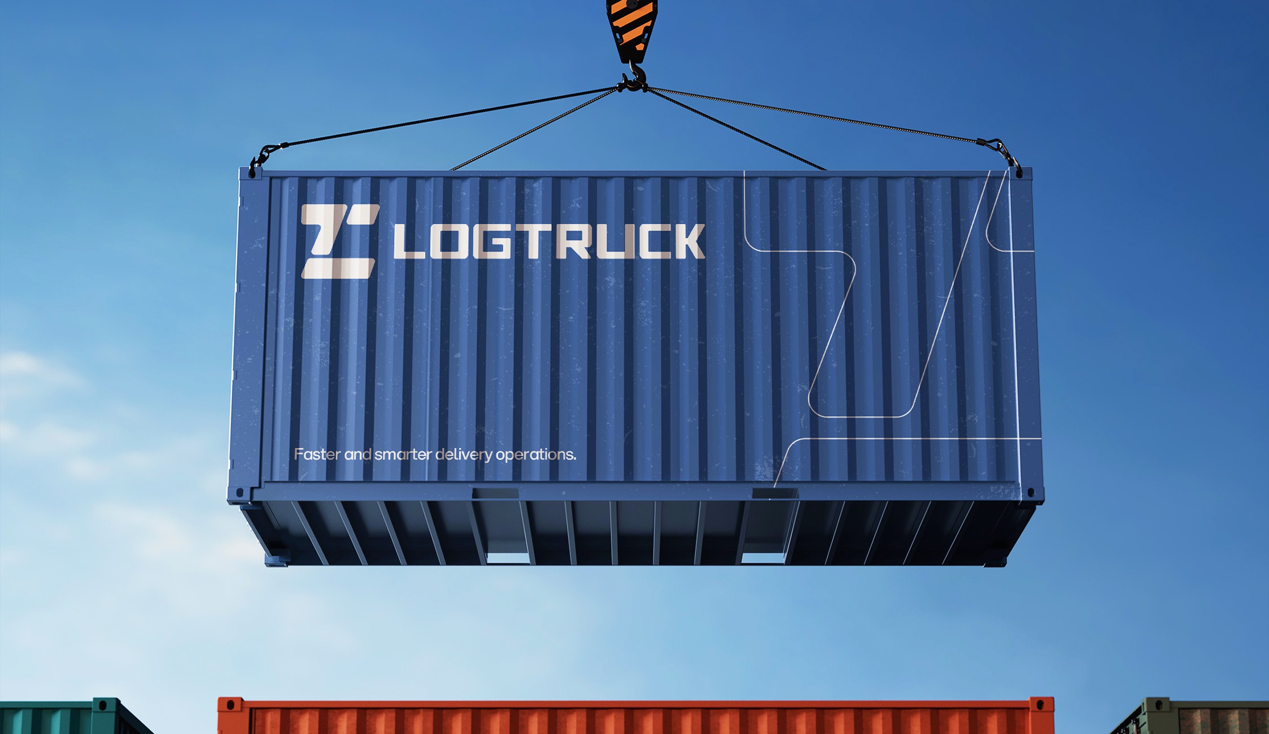
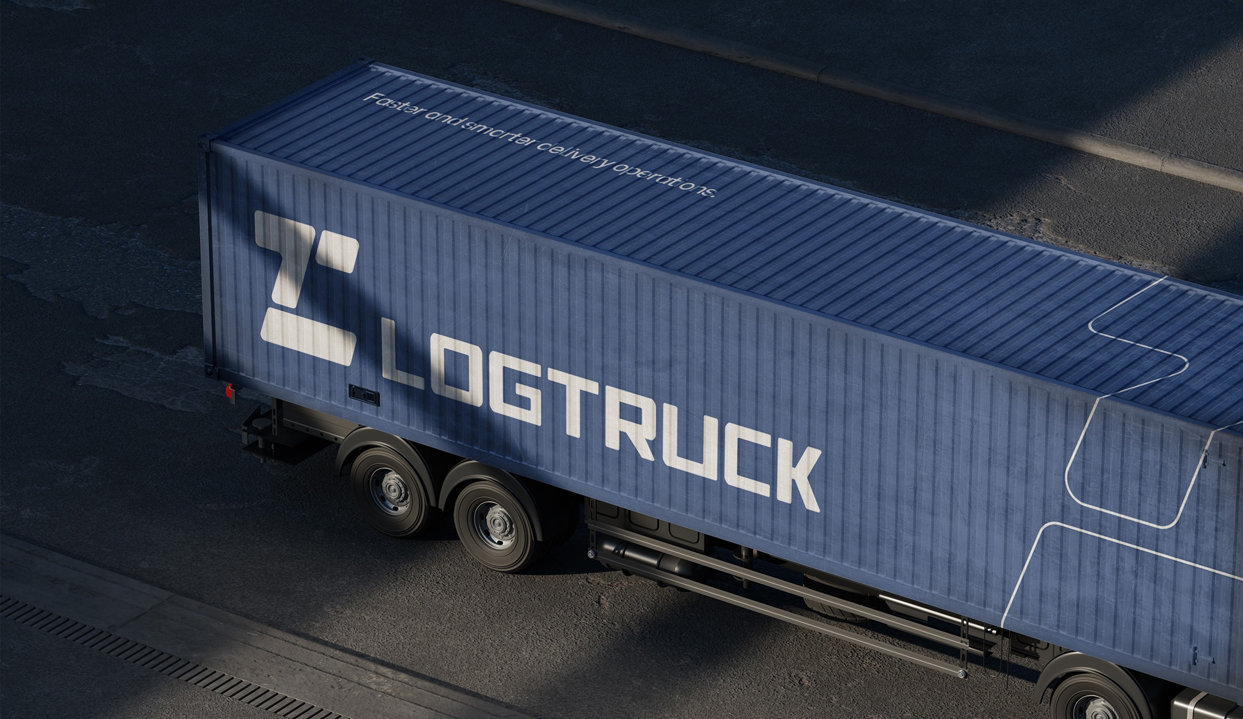
To break away from the dated, utilitarian aesthetic typical of the logistics industry, the marketing website was designed to feel less like a corporate brochure and more like a cinematic introduction to a high-tech ecosystem.
We utilized a split-screen layout to balance heavy industrial imagery with clean, scannable typography, ensuring the content feels authoritative yet accessible. The visual language combines deep 'Midnight Slate' backgrounds for immersive data visualization sections, such as the global coverage map with crisp white sections for trust-building content like testimonials and FAQs.
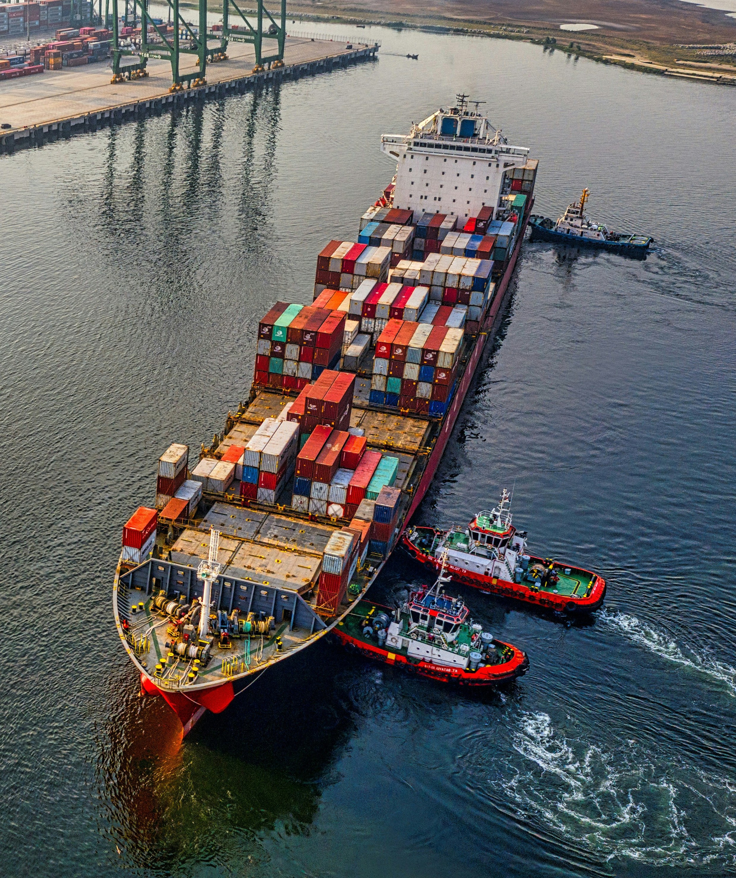
High-fidelity 3D assets of shipping containers and warehouses were integrated to elevate the brand perception from a basic service provider to a premium, tech-forward infrastructure partner, mirroring the sophistication of the dashboard itself.
Impact and success metrics
The redesign is built to reduce operational drag caused by spreadsheet edits, repeated phone calls, and long email threads, replacing them with shared visibility, faster dispatch actions, and reusable shipment history.
Success was defined through measurable product outcomes (to track after launch): time-to-dispatch, exception response time, percentage of shipments tracked end-to-end in-platform, repeat-quote creation time, and invoice aging reduction.
45%
Reduction in daily check-calls to carriers.
3x
Faster quote creation speed using the "Reuse" feature.
100%
Visibility on invoice aging, reducing late payment penalties by 20%.